
Ever walked past a shop and felt instantly drawn in by their signage? Or perhaps you’ve spotted a sign so cluttered you couldn’t figure out what the business does? What makes some custom sign printing unforgettable while others fade into the background? And more importantly, how can you make sure your signage falls into the first category?
Custom sign printing is far more than just slapping your logo onto a board and hoping for the best. It’s a powerful marketing tool that works around the clock, speaking to potential customers even when you’re not there. Whether you’re launching a new retail store in Sydney, setting up an exhibition stand in Melbourne, or refreshing your fleet branding in Brisbane, getting your signage right can make a genuine difference to your bottom line.
In this guide, we’ll explore everything you need to know about creating custom signs that truly stand out. From understanding the basics of sign printing to mastering design principles that capture attention, we’ve got you covered. You’ll discover how to avoid common mistakes, learn about different business applications, and get practical tips for working with professional printers. Let’s get stuck into it!
Understanding Custom Sign Printing Basics
Custom sign printing is the process of creating bespoke signage tailored specifically to your business needs. Unlike generic, off-the-shelf options, custom sign printing allows you to showcase your brand personality and communicate your unique message effectively.
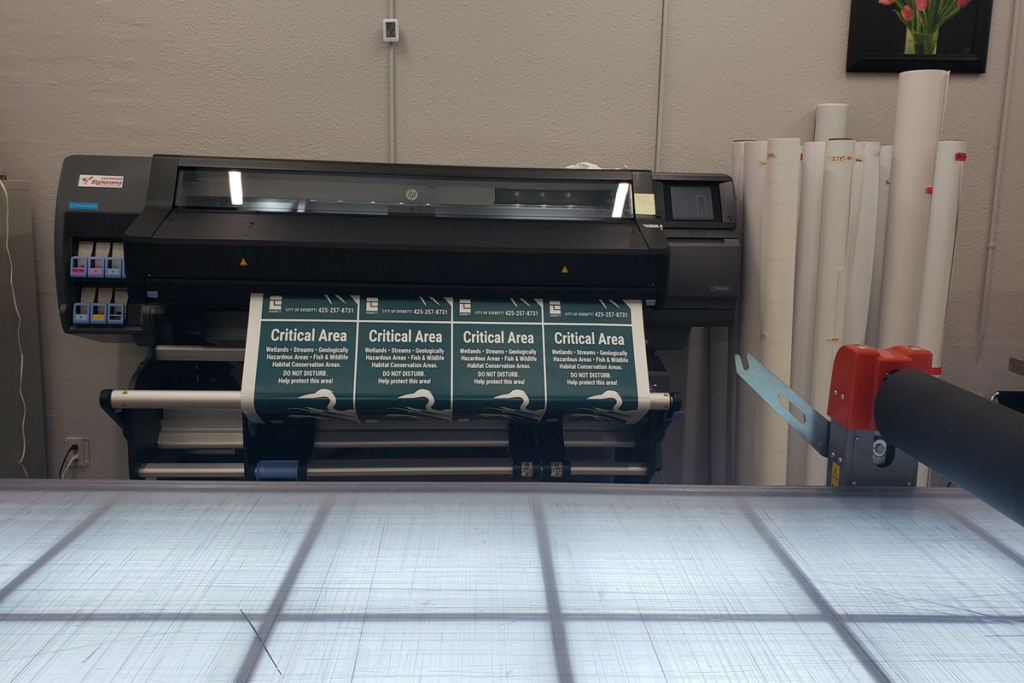
The process typically involves designing your artwork, selecting appropriate materials, and using professional custom sign printing techniques like digital printing, screen printing, or vinyl cutting. Modern printing technology means you can achieve vibrant colours, sharp details, and durable finishes that last for years.
Types of Custom Sign Printing and Materials
The world of custom signage is incredibly diverse. You’ve got banners perfect for events and promotions, corflute signs ideal for real estate and construction sites, aluminum composite panels for building facades, and vinyl decals for windows and vehicles. Each type serves different purposes and environments.
Choosing the right material depends on where your sign will live. Outdoor signage needs weather-resistant materials like aluminum, acrylic, or treated timber. Indoor signs can use lighter options like foam board or fabric. Consider factors like sunlight exposure, moisture levels, and how long you need the sign to last.
Essential Design Principles for Maximum Visual Impact
The Psychology of Colour in Sign Design
Colour isn’t just about looking pretty, it triggers emotional responses and influences behaviour. Red creates urgency and excitement, perfect for sale signs. Blue builds trust and professionalism, ideal for corporate branding. Yellow grabs attention quickly, which is why it’s popular for warning signs.
When selecting colours for your signage, think about your brand identity first. Your sign colours should align with your existing marketing materials. Also, consider the environment where your sign will be displayed; a green sign might disappear against a leafy backdrop!
Typography That Gets Noticed
Font selection can make or break your sign’s effectiveness. Sans-serif fonts like Arial or Helvetica are generally easier to read from a distance. Avoid overly decorative or script fonts for the main text; save those for accent elements only.
Size matters enormously with signage typography. A general rule: for every 3 metres of viewing distance, your letters should be at least 25mm tall. So if customers typically view your sign from 30 metres away, your text needs to be roughly 250mm high.
How Do You Make a Sign Stand Out?
Creating standout signage requires balancing several elements. First, establish a clear visual hierarchy to determine what the most important information is. Make that the largest and most prominent. Your business name and key message should be immediately obvious.
Use contrast strategically. Light text on dark backgrounds (or vice versa) dramatically improves readability. Incorporate whitespace generously; it gives the eye somewhere to rest and makes your content easier to process. Don’t forget about imagery; a well-placed graphic or photo can communicate faster than words alone.
What Makes an Effective Custom Sign Printing?
The 3 Second Rule
Here’s a reality check: most people give your sign about three seconds of attention. That’s it. In that tiny window, your sign needs to communicate who you are, what you offer, and why someone should care.
This means ruthless editing. Every element on your sign should earn its place. If something doesn’t contribute to your core message, cut it. Focus on one primary message and make it impossible to miss.
Contrast and Visibility Considerations
Visibility changes dramatically with distance and lighting conditions. What looks fantastic on your computer screen might become an illegible blur when printed large and viewed from across the street.
Test your designs by printing a small version and viewing it from several metres away. Can you still read everything? Are the colours distinguishable? Consider how your sign looks in different lighting: morning sun, afternoon shade, and artificial streetlights. The best signs remain readable in all conditions.
Size and Placement for Australian Businesses
Australian local councils have specific regulations about signage size, placement, and illumination. Before finalising your sign design, check with your local council about any restrictions. Nothing’s worse than investing in beautiful signage only to discover it doesn’t comply with regulations.
Think strategically about placement. Where will viewers be when they see your sign? What direction will they be travelling? Signs placed perpendicular to traffic flow typically get better visibility than those running parallel to it.
Common Sign Design Mistakes to Avoid
Overcrowding Your Sign
The temptation to include everything, your phone number, website, email, social media handles, opening hours, full product list, and mission statement, is strong. Resist it. Cluttered signs overwhelm viewers and ultimately communicate nothing.
Stick to the essentials. Your business name, what you do, and one clear call to action (usually a phone number or website) is plenty for most signs.
Poor Colour Combinations
Some colour combinations are simply hard to read. Yellow text on white backgrounds, light grey on light blue, red on green, these pairings cause eye strain and reduce comprehension. Stick to high contrast combinations that work even for viewers with colour blindness.
Ignoring Brand Identity
Your signage should feel like a natural extension of your brand. Using completely different colours, fonts, or imagery creates confusion and weakens brand recognition. Maintain consistency across all your marketing touchpoints, including signage.
How Do I Create My Own Custom Sign Printing
DIY Design Tools
Programs like Canva offer user-friendly templates perfect for basic signage design. For more control, Adobe Illustrator or free alternatives like Inkscape let you create vector graphics that scale perfectly to any size.
If you’re designing yourself, work in CMYK colour mode (not RGB) for accurate colour reproduction. Set your resolution to at least 150 DPI for large format printing; 300 DPI is better for smaller signs viewed up close.
Working with Professional Custom Sign printing
Professional sign companies bring expertise you simply can’t replicate at home. They understand material properties, printing limitations, and installation requirements. A good sign printer will review your artwork, suggest improvements, and ensure the final product meets your expectations.
When preparing files, supply print-ready PDFs with fonts outlined or embedded. Include bleed (usually 3-5mm) and clearly mark any trim lines or fold lines.
Custom Sign Printing for Different Business Applications
Retail storefronts benefit from illuminated signage, window graphics, and A-frame boards that draw foot traffic. Event and exhibition signage needs to be portable, quick to set up, and visually striking from all angles.
Construction sites require durable, weather-resistant custom sign printing that communicates safety information clearly. Vehicle and fleet signage transform your company vehicles into mobile billboards, just ensure designs remain readable at speed.
Tips for Getting the Best Results from Your Custom Sign Printing
Ask your printer about material recommendations, expected lifespan, and maintenance requirements. Request a physical proof if possible, screens display colours differently from printed materials. Understand turnaround times upfront, especially if you’re working to a deadline.
Bringing Your Custom Sign Printing Vision to Life
Creating effective custom signage isn’t rocket science, but it does require thoughtful planning and attention to detail. By understanding the basics of sign printing, applying solid design principles, and avoiding common pitfalls, you’re well on your way to signage that genuinely works for your business.
Remember, your sign is often the first impression potential customers have of your business. It’s worth investing time and resources to get it right. Whether you’re going the DIY route or partnering with professional printers, keep your audience in mind at every step. What do they need to know? What action do you want them to take?
Now it’s over to you. Take these tips, apply them to your next signage project, and watch your custom sign printing make the impact they deserve. Your business’s visual presence is waiting to shine so get designing!